Project Summary: What's the Weather Like?
Whether financial, political, or social -- data's true power lies in its ability to answer questions definitively. Python requests, APIs, and JSON traversals were used to answer the question: "What's the weather like as we approach the equator?"
Python scripts and matplotlib were used in this project to visualize the weather of 500+ cities across the world of varying distance from the equator.
CityPy library and OpenWeatherMap API were utilized to generate retrieve random list of cites, associated weather data and create a representative model of weather across world cities.
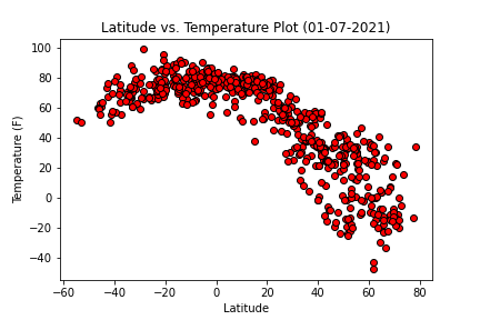
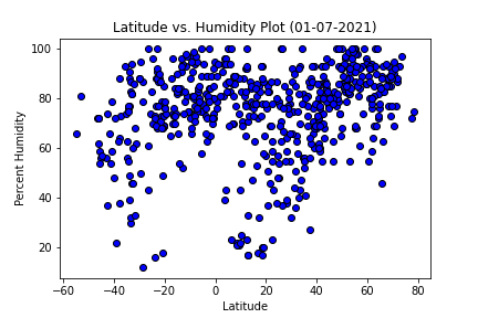
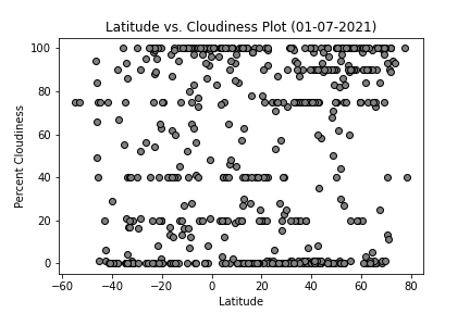
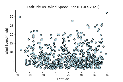
A series of scatter plots were created to showcase the following relationships:
- Latitude vs. Temperature (F)
- Latitude vs. Humidity (%)
- Latitude vs. Cloudiness (%)
- Latitude vs. Wind Speed (mph)
Observations
- The max temperatures (F) (y-axis) are highest closest to the equator (latitue 0). As you get farther away from the equator (higher latitude value, x-axis), the max temperatures (F) decrease.
- The temperatures (F) (y-axis) are lowest farther away from the equator (latitue 0). As you get closer to the equator (higher latitude value, x-axis), the max temperature (F) increases.
Explore Weather Visualizations
Python scripts and matplotlib were used in this project to visualize the weather of 500+ cities across the world of varying distance from the equator.
Show me the Weather


